


Lamb to the Slaughter Zine
To Read Online
https://issuu.com/mvdesign651/docs/lambsheet
The Lamb to the Slaughter zine is a redesign of the short story of the same name by Roald Dahl. Roald Dahl was well known for his children’s stories but not much attention is brought to his darker short stories for adults. Having read this short story in high school it has always left a lasting impression on me that led me to create a newly redesigned cover and story interior to bring readers into the atmosphere that Roald Dahl created in his stories.
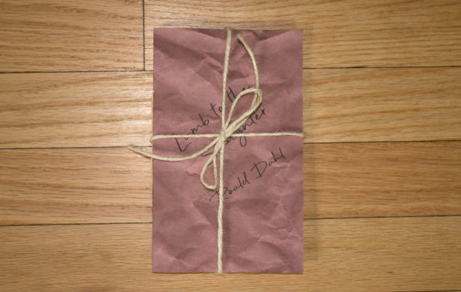
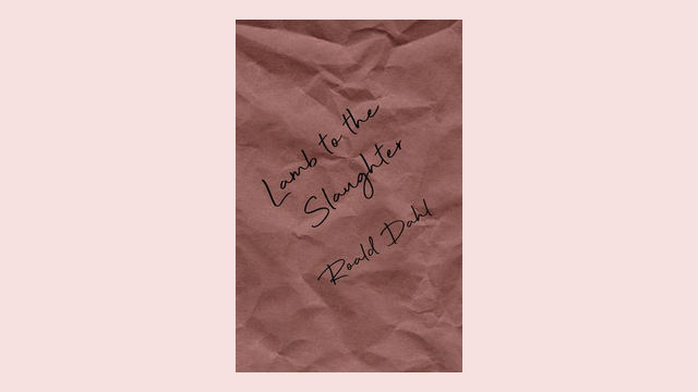
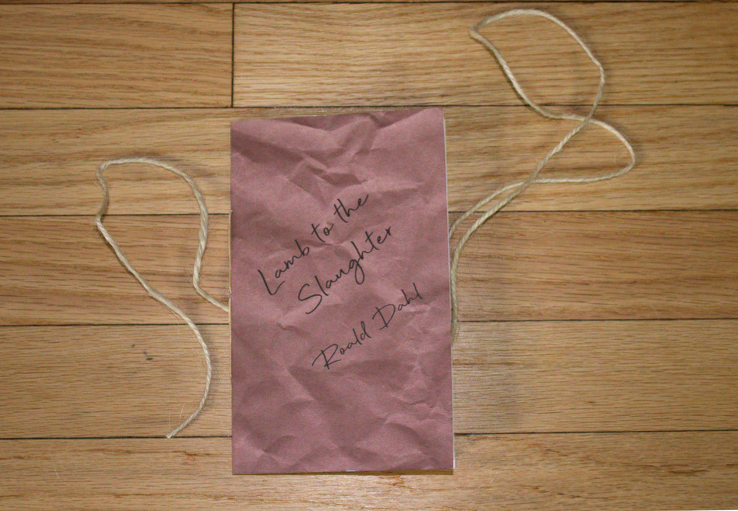
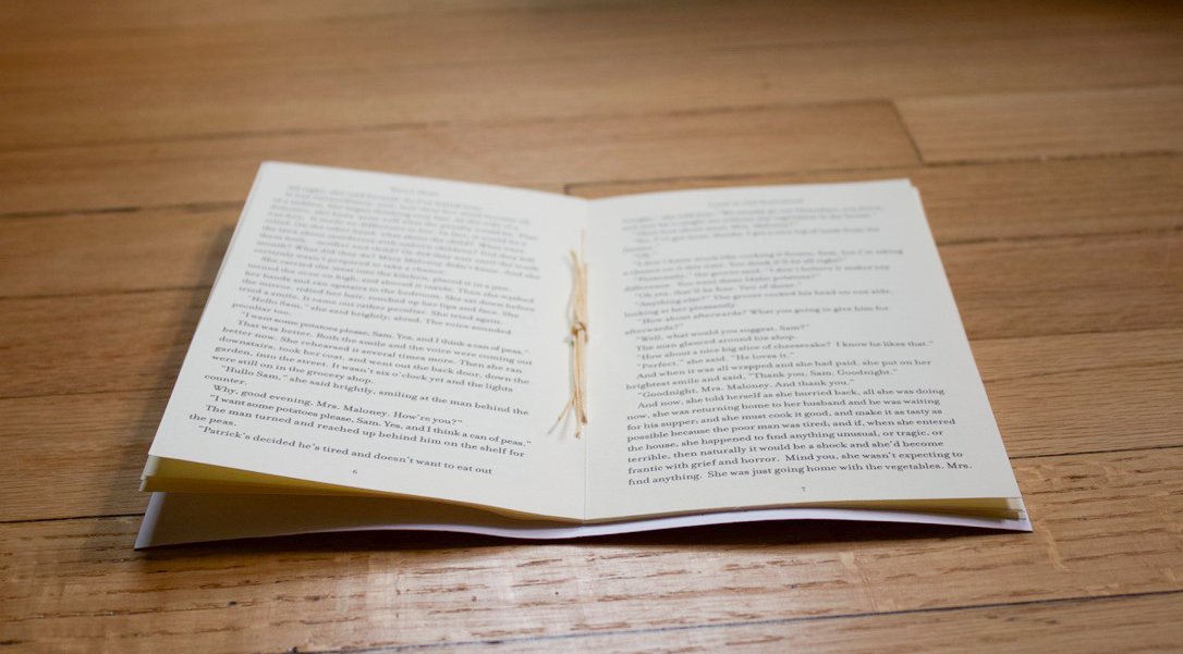
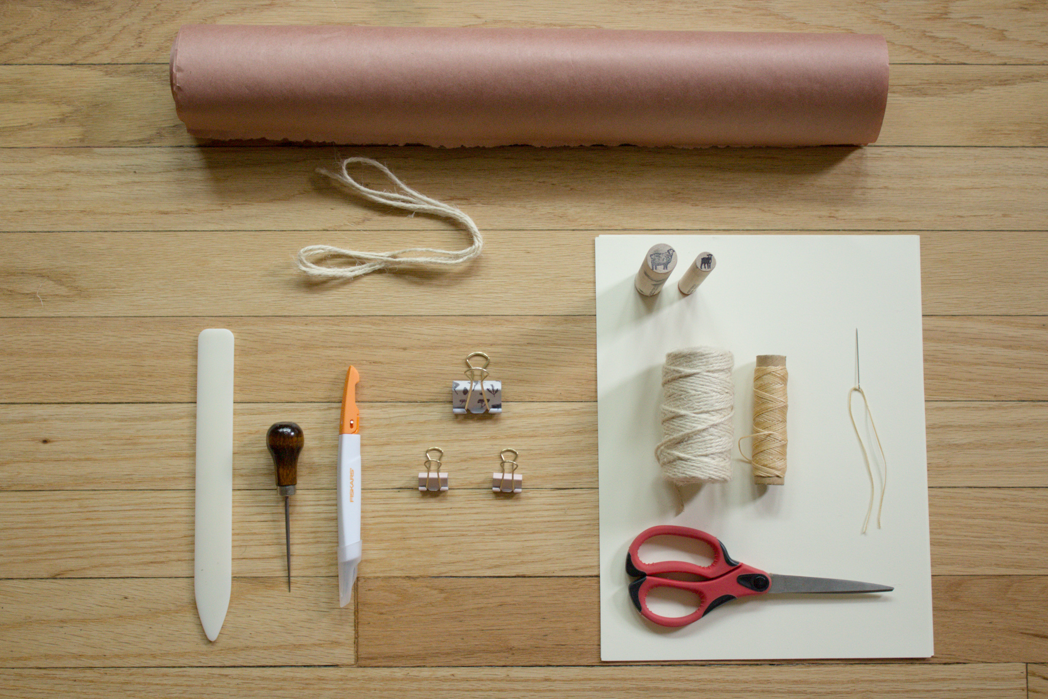
For the design of the cover, I used butcher paper as a textured background to give the cover a realistic feel of it being an item you would receive at a butcher shop seeing as the main object in this story is a leg of lamb. For the title of the text, I used a handwritten font to exemplify its overall feel of it being packaged by a butcher. I then used a twine string to bind the book together to finish its overall appearance.
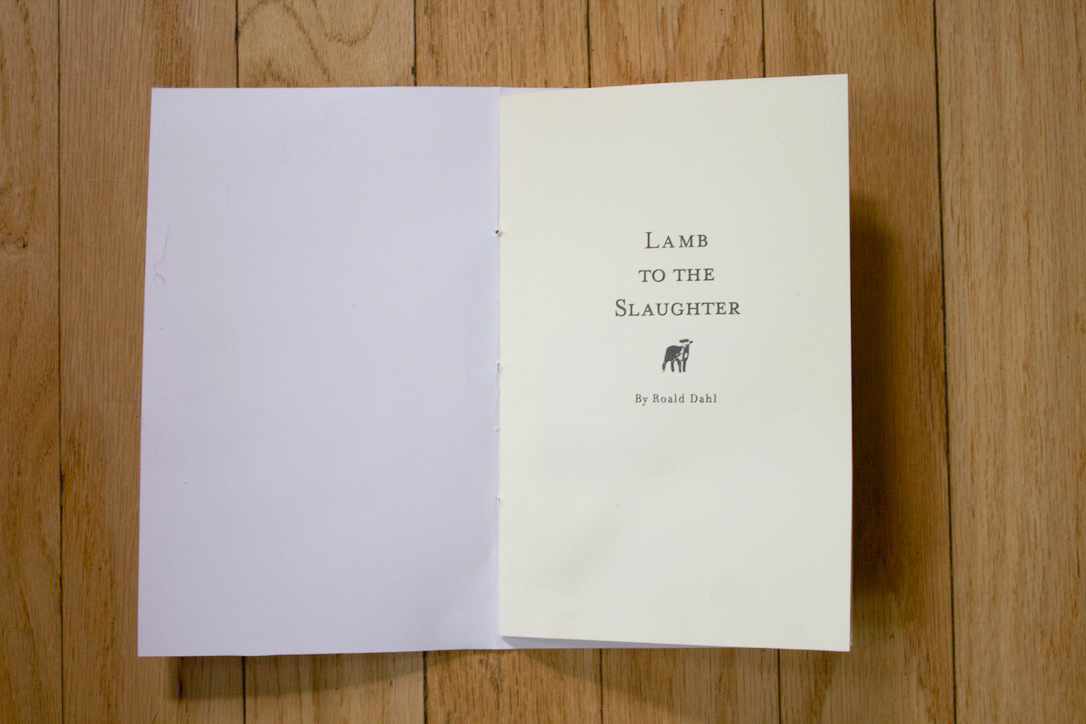
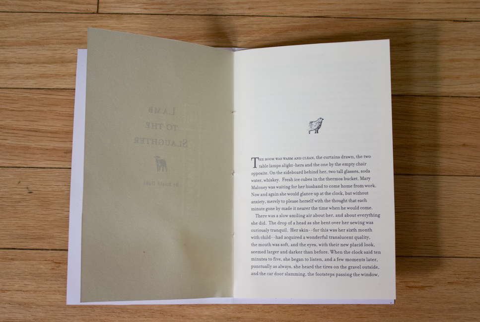
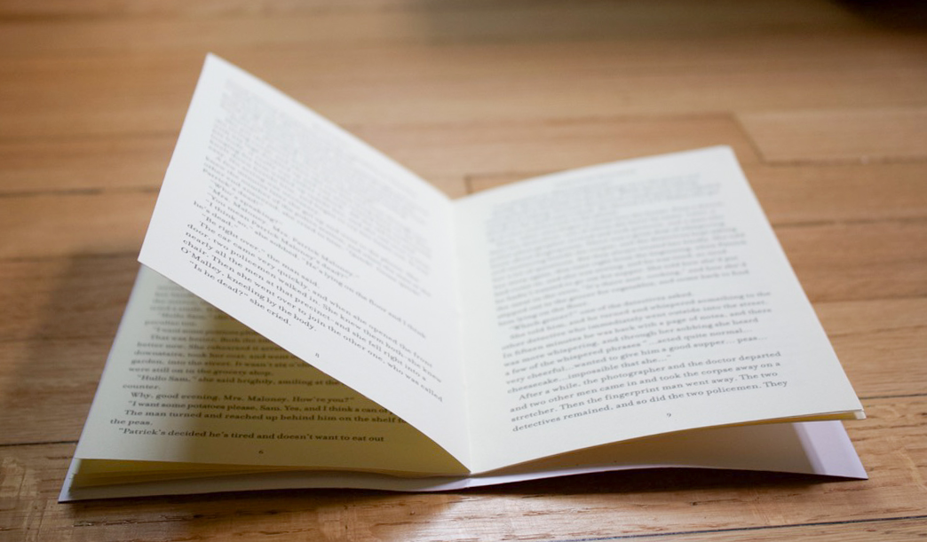
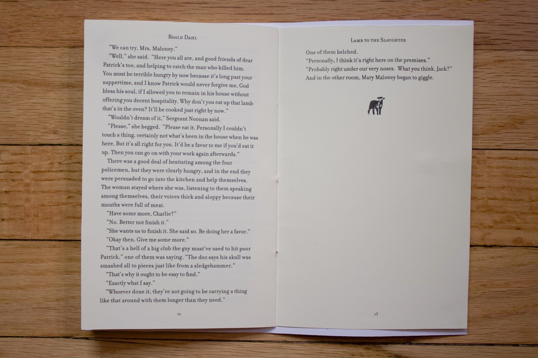
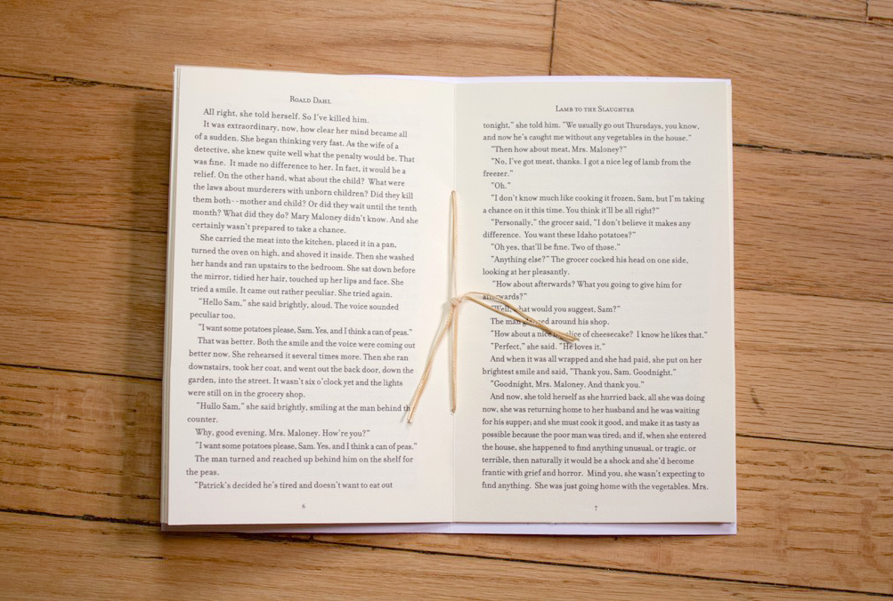
For the design of the interior of the story, I used InDesign to design the manuscript in a visually engaging way to give more of an impression of the chilling story. I then used lamb stamps as a motif to visually remind the readers of the symbolic meaning that the “lamb” represents in the story. Then using Filosofia for the body copy to give it a vintage yet classic feel.
Special thanks to Faride Mereb, a professor at the Center of Book Arts for guiding me on the design and conceptualization of this book.